uxwithmelissa

Card
discovery optimisation
DISCOVERY / UX / RESEARCH
This initiative focuses on helping customers find the right card faster and with more confidence, reducing friction, confusion, and decision fatigue earlier in the journey.
Card discovery is one of the highest-impact stages of the customer journey, yet it remains fragmented across multiple entry points (Search, Jordy, Saved Cards, Recommendations, etc.), with inconsistent experiences and varying effectiveness.
Role & Scope
Responsibilities:
-
Product discovery and problem definition
-
Designing end-to-end journeys optimising for Mobile web
-
UX and UI design, from concept through launch
-
Close collaboration with Product, Engineering, Commercial, and Marketing
-
Post-launch evaluation and iteration planning
Hypothesis - by offering customers better ways to find, refine and choose a card, customers will be less likely to have choice fatigue, find better more tailored content.
💡 Project Problem
Problem Statement
Thortful has a huge catalogue of cards approximately 60,000 and one problem we identified is being able to surface more relevant content to customers. We know from the data that 60% of users landing on a product list page but only 40% of those users are adding an item to basket.
Customer Problems
-
Find a card that feels “right” quickly
-
Recover when they hit a dead end
-
Understand why certain cards are being shown
-
Re-discover cards they’ve previously liked or considered
Delivery Milestone 1
-
Implementation of suggested search
-
Improvements to filters
-
UI update
Outcomes
-
YoY conversion up 5ppt
-
Mean time to convert down 27%
-
Customers adding to basket up 3.4%
Quick overview

Suggested search
What did we change?
We made several improvements to our search function, including the ability to include recommended searches, when you start typing, as well by usuing a vector search the results are now faster and scroll through better indexes as well as surface to customers previous searches, to help solve the problem over customers struggling to find cards they have seen previously.
We also built a custom CMS to help give the business the ability to curate the search leading up to a peak occassion.
What was the outcome?
Customers are now able to see better more accurate results when they type a search. Recommendations help those users who might be stuck or lacking inspiration.
Outcome:
-
number of customers searching increased by 1.5%
-
Those who use a search typically convert around 60%
Filters
What did we change?
We made several improvements to our search function, including the ability to include recommended searches, when you start typing, as well by usuing a vector search the results are now faster and scroll through better indexes as well as surface to customers previous searches, to help solve the problem over customers struggling to find cards they have seen previously.
We also built a custom CMS to help give the business the ability to curate the search leading up to a peak occassion.
What was the outcome?
Customers are now able to see better more accurate results when they type a search. Recommendations help those users who might be stuck or lacking inspiration.
Outcome:
-
number of customers searching increased by 1.5%
-
Those who use a search typically convert around 60%

Project Scope
By encouraging users who search to go to more focused and more relevant pages we hope to be able to increase conversion. Our proposed solution for this is to introduce ‘suggested searches’ as a dropdown when a customer types in the search bar.
Overall search goals:
-
Ensure that search is both reliable - results served through search match customer expectations
-
Search should be intuitive and take the guesswork away for our customers - it should make finding relevant cards on site easier and help showcase our range and breadth
-
‘I want our search to be as easy to use as Google - search should be the default behaviour for customers, reducing reliance on applying filters
Defining the Problem statement
To enable users to have better tools to enable them to find more breadth and relevant content, quicker and easier. To improve relevancy of content to instill high confidence and trust for thortful. To make the onsite shopping experience simple and quick, encourage customers to shop for multiple cards.
Discovery definition
My first step in this project was to understand the targeted users of this project, the business initiative, the tech scope and most importantly the concept validation. Using previous research studies, there were plenty benchmark assumptions we had about the browsing behaviours of our users. There I found a great start in understanding the space, however, I had some more focused questions I needed to seek answers to:
-
What do customers find useful when browsing on e-commerce sites?
-
How do they behave with our site?
-
What happens when they can't find the perfect card?
What do we already know?
After reading through existing research , I decided to pair with my Product Manager to seek some further answers from any data we might have conducted previously. Together we found the following:
-
Around 30% of customers on web search during a session
-
Top search query on web is simply ‘birthday’ with an average of 5k searches a month
-
More than 50% of customers view more than 80 cards.
-
Of those that checkout, more than 50% view 120 cards in the card list
-
Conversion rate for broader search results like ‘birthday’ is lower than searches
Therefore from the above information we had a good baseline of what customers do, now we needed more behavioural insights of why users behave this way. Therefore we decided to run qualitative research with 20 users from different customer cohorts.
Research Plan
In order to support this core pillar, I decided that we needed to understand more about our customers. Therefore I pitched to my Product Team to run research around card discovery. Each person in the team would have different roles each week, to help get the product team well rounded in research and prevent research fatigue. We had a list of assumptions that we wanted to validate by research, that we could then use to feed back into the wider business strategy. We decided to speak to 20 participants, asking detailed questions about their card buying behaviours, their exceptions before buying a card and a screen sharing exercise.
Assumptions from data and previous research:
-
Customers who made a search are more likely to purchase
-
Filters are used when a card cannot be found from search
-
Customers who narrow down their choice through searching or filtering convert better
-
Majority of users only enter a search
-
Our infinite scroll shows that shoppers will spend up 20 minutes scrolling on our site
-
Our key word search terms do not behave as they would expect
What does the data tell us?
-
Users search multiple times, the average search user will make 2.5 searches a day.
-
Currently around 20% of web customers apply filters when on a product list page.
-
Filters are applied when they cannot find a card from a search
-
Conversion rate from filtering is 50%, and around 24% of total customers who checkout are using filters.
-
Customers who made a search are more likely to purchase
-
Of the users that make a search, almost half go onto convert (44.5%).
Core research questions:
-
What are customers upfront expectations around searching for a card?
-
Understand how to customers engage with search and filters - did it meet their expectations
-
Understand what blocks/stops customers from buying all their cards with us
User profiles
When we spoke to participants, I created a template for us to fill in to help break the findings into different themes, cor observations and follow up actions.

Affinity Mapping & opportunities
Using the framework from note taking, as a Product Team we then broke the notes into core themes, using an affinity mapping framework.

.jpg)
Presenting the research topics to the Product Managers
Define
Refining the opportunities
We have now completed the research, validated our assumptions and now we needed to refine which of the opportunities we wanted to go after.
Prioritised opportunity themes:
-
How might we improve search relevance and suggestions
-
How might we increase filter confidence and prevent over filtering
-
How might we offer an improved look and feel to assist with their browsing needs
Ideation workshop

Ideation refinement
Using a RICE scoring method we decided to weigh up each of the ideas against impact and effort - going after ideas that had the most impact and least effort. I lead this workshop with the Product manager and the engineering team so that we could have a high level of confidence on the amount of tech effort. Ideas in pink where quick wins we felt we could commit to before kicking off the discovery quarter.
High level requirements

Ideation


DELIVERY
📱Experience Design
Key Journeys
For these wires I was only looking at the discovery part of the funnel, PLP-Basket.
-
Filter optimisation
-
Improved Search functionality
-
Saved cards
-
Scroll savers
Filter Placement
As part of the re-design I wanted to reduce the amount of space our current filter button uses, so that we can bring up the visibility of the card content. Currently those on a small device, majority of the cards are underneath the fold. Therefore it was important for me to explore how to maximise the card content space but ensure that customers could still have access to the filters.
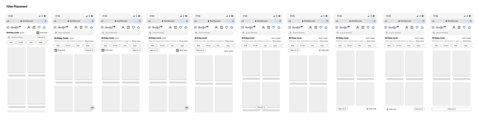
Mini Pills & Filters
Once I had decided on where the filters might sit, I then decided to look at how we could bring the mini pills on the same line as the filter button. The rational for this was the mini filters were essentially a preview of the filters and made sense contextually to align them here.

Browse by Sentiment
This ideation was quite top level. Since we are a card company and emotions is at the heart of everything we do I wanted to play with the idea of browsing by feeling. Could you encompass the emotions you wanted to convey into your browsing behaviours.
-
"I want to make some smile"
-
"I want to make them cackle"
-
"I want them to know just how much I love them"

Suggested Search Ideation
Why is suggest search important?
Our current catalogue has a huge offering, which whilst that is a benefit it can also increase friction for customers trying to find the exact card.
Suggested search is a great tool for finding related content quickly and easily. It helps to narrow down a search to the most relevant content, saving time and effort. Additionally, it can help customers to discover new content that they may not have previously considered before.
Suggested Search from Homepage
With suggested search from homepage we decided to prompt searches from the top recipients and styles. For the first iteration we decided to test how well the feature worked with occasions.

Suggested Search from Product List Page
Suggested search from a Product List page allows customers to search within a category. From competitor analysis we know that a lot of other companies offer the ability to search within an occasion, which was something we were not currently offering.


New Designs

How Are We Measuring Success?
As you can see from the chart here, those that use suggested search have a much higher rate of completing a purchase. The chart shows below,, those who used suggested search in Blue Vs those who did not use suggested searched in Green, fewer people completed checkout done.


Suggested search to checkout done
This shows that the number of users clicking on a suggest search have a higher rate of completing check out done vs those who do not use a suggested search.
Time taken to complete checkout done
This chart shows that those who use suggested search shown in Blue, take significantly less time to checkout done vs those who do not use suggested search in Green.
Hotjar
The improvements we've made in site experience are also reflected in the hotjar ratings and feedback (which we receive via the onsite feedback button). The average customer Hotjar rating has gone up from 3.35 last January to 3.9 January 2023 across a very similar number of responses (c.750 each month)

Next Steps
-
To continue to expand suggested search terms into more categories such as styles, age and popular searches.
-
Bring the new filters across into the gifting journey to align the experience
-
To allow customers to filter for "anyone" moving away from gendered filters