Melissa Cameron

ABOUT THE PROJECT
Crafting app to centralise all knitting and crochet processes.
Stitchly is a conceptual mobile app designed to simplify the knitting and crochet experience for beginner and intermediate makers. The project was inspired by my own frustrations with finding affordable beginner-friendly patterns, managing projects across multiple platforms, and keeping track of progress while crafting. Through user research (my crafty group I run) and competitor analysis, I identified a gap in the market for a more connected and beginner-friendly experience. Stitchly brings together pattern discovery, project organisation, progress tracking, yarn stash management, and personalised recommendations into one seamless platform, helping crafters feel more confident, organised, and supported throughout their crafting journey.
FINAL DELIVERABLES
Design Overview
The main considerations for this project and after looking at what is out there on the market currently was beautiful design. I want the app to feel well crafted, soft colour palette, traditional fonts, whilst baring in mind accessibility, the app needed to feel as special and as beautiful as when crafters are knitting or crocheting as well as providing a functional purpose.
The designs focus around the core areas:
-
Picking up a project easily at any point
-
Utilising materials you already own
-
Easy digestible pattern structure
-
Clean UI

Product in situ
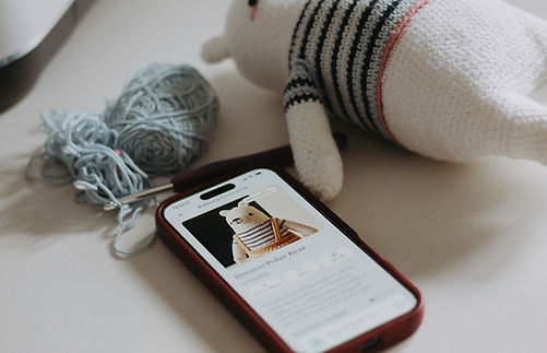
I wanted the app to be so intrinsically part of the crafting expierence, you're not even aware that you are using an app. I love using books to build patterns from, but then that requires physical pieces of paper, a pen and not very practical when traveling and crafting. These photos are from various projects I am working on.


Feature review
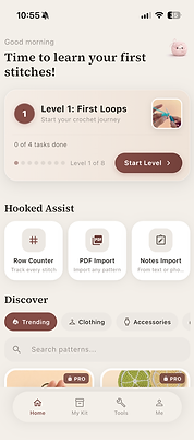
Onboarding and homepage
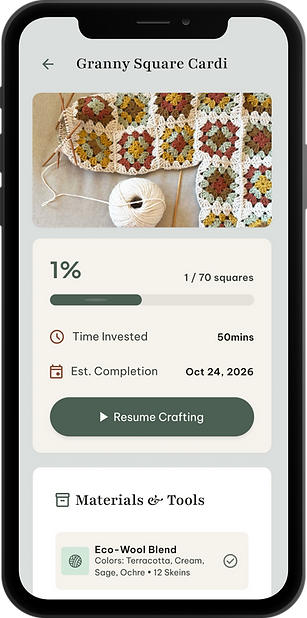


Progress trackers
Following a pattern
Following a pattern
Video Tutorials
Following a pattern
Following a pattern
Following a pattern
Resume project
Row tracker and pattern
Video tutorial
Following a pattern
Following a pattern
Following a pattern
Stitchly
FULL CASE STUDY
01 KICK OFF
Problem Definition
As a Knitting and crochet enthusiasts myself, I know first hand how frustrating learning these crafts can be, especially at the beginning, often it's a struggle to manage the full crafting journey in one seamless experience. Patterns are typically scattered across multiple platforms such as PDFs, Pinterest, Etsy, screenshots, and apps, making them difficult to organise and revisit. Existing crafting apps tend to focus on single functions like row counting or pattern storage, but rarely provide an intuitive, all-in-one experience.
Following patterns on your phone is nearly impossoble
Thortful was losing ~8% of its highest-value customers year on year — the senders whose habit drove a disproportionate share of revenue. Acquisition wouldn't fix it.
Remembering where you left off in the project leads to mistakes
They're episodic — birthdays, anniversaries, condolences, just-becauses. A monthly recurring subscription would feel like dead money in slow months.
Most apps offer very basic features or hide behind a paywall
Of four models tested (recurring sub, loyalty, credits, one-off membership), the recurring monthly fee performed weakest. Customers told us, plainly, that paying every month for an episodic purchase felt cynical.
02 DEFINE
Another row tracker was not what crafters where looking for
When doing some competitor analysis there are apps that are trying to solve some of these crafting problems.


Analysis Findings
Participants had tried apps such as:
-
Ribblr
-
Yarn Buddy
-
My Row Counter
While users appreciated individual features, many felt current apps lacked simplicity and ease of use.
Common complaints included:
-
Cluttered interfaces
-
Too many features upfront
-
Confusing navigation
-
Interfaces feeling dated
-
Features designed for advanced users
Most of the apps, also leverage very heavily on Ai patterns and remove the handmade human element.
Customer Research
Product Discovery Findings
To better understand the challenges knitters and crocheters face throughout their crafting journey, I conducted face-to-face interviews with 10 members of a local crafting group. Participants ranged from beginner to intermediate skill levels and included both knitters and crocheters, as well as users transitioning between the two crafts.
The goal of the research was to uncover:
-
Current frustrations with knitting and crochet apps
-
How users discover and organise patterns
-
How users track progress during projects
-
What users would expect from an ideal crafting companion
Key Findings
1. Patterns are fragmented
Users have patterns saved everywhere, from Etsy downloads to notes apps, makes it hard to find a pattern again. Looking for one consolidated area to manage and use. Often leads to screenshotting the pattern or manually printing.
"My pet peave is, I download a PDF and follow the instructions on my phone, but lose what page I am on"
2. Existing apps feel over indexed for Ai
All the projects and the interface looks like its been led by Ai. This gives users low confidence in using the patterns and the app. "Will the end product even look like that". "It really loses the human element of making stuff by hand".
3. Losing track of a project, impacts motivation
Users mentioned if they can't pick up where they left off easily then they tend to just give up on the project.
"I don't crochet every day so then not remembering where I am in the pattern and doing the wrong row and having to undo, really de-motivates me"
4. Users want better guidance
Users mention that they would like some level of support/guidance when using the app. This could be video clips relevant to the row you are making so that you can follow along accurately.
Hypothesis
We expect that reducing friction throughout the crafting journey — particularly around finding suitable patterns, tracking progress, and managing materials — will improve user engagement, reduce project abandonment, and create a more enjoyable crafting experience overall.
03 DEVELOP
Ideation
When doing some competitor analysis there are apps that are trying to solve some of these crafting problems.
Analysis Findings
Participants had tried apps such as:
-
Ribblr
-
Yarn Buddy
-
My Row Counter
While users appreciated individual features, many felt current apps lacked simplicity and ease of use.
Common complaints included:
-
Cluttered interfaces
-
Too many features upfront
-
Confusing navigation
-
Interfaces feeling dated
-
Features designed for advanced users
Most of the apps, also leverage very heavily on Ai patterns and remove the handmade human element.
03 DELIVERY
Wire frames
Key Journeys
I mapped the full subscription lifecycle, including:
-
Discovery (PDPs, basket, account entry points)
-
Sign-up and payment
-
Post-purchase confirmation and expectation setting
-
Ongoing subscription management
This helped identify high-risk moments, particularly around eligibility, renewal understanding, and where users expected to manage their subscription. This also helped flag nuance behaviours in our current platform and design for edge case scenarios. There were 80+ screens in total that were mapped out.

Wire frame flow of non-subscriber journey
What were we optimising for?
In these wireframes my main focus was how to showcase the subscription across site, without detracting from customers primary reason for being on site - to buy a card.
What did we deliberately not do?
There were 3 core behaviours I did not want to include:
-
-
Pushing the upsell to much it caused customers to drop put. The placements were strategic with the least amount of risk to customer and the business.
-
Auto on - these felt like a cheap tactic and did not align with “valuing” customers.
-
Offer cannabalism - we have a few very strong offers customers use regularly. How did we make sure which was the best offer and make sure customers didn’t feel like they were loosing out.
-
How did research inform my decisions?
-
The research indicated that clear price proposition was integral.
-
Being able to opt out at any time, no long term lock in
-
Must be simple and easy to either add or dismiss, must not block primary reason for being on site - buying a card